Collect information from an Excel
OBJECTIVES:
- Choosing a chart style
- Gathering and organizing information
- Displaying or Moving a chart
- Getting the big picture
- Changing a chart style

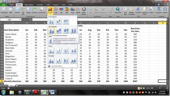
2. Click on the Insert tab and select the Column feature as seen below

3. Choose the column chart you want to display, in this case we are going to choose the 3-D Clustered Columns
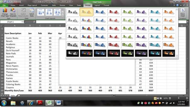
4. You screen should now look similar to the image below. You should be on the Design tab. You can browse the Chart Styles by clicking on the dropdown arrow at the right of the Chart Styles section on the ribbon.

5. Once you have located and clicked in the dropdown arrow this is what you will see, choose one of the styles available to you. We are going to choose the one in the top row, second column, highlighted in orange.
6. You will not see any change until you have extracted the data for the chart. On the Design tab/ribbon choose Select Data, as shown below

7. The Select Data Source dialogue box will appear, see below. Click the small square at the right end of the Chart Data Range field located at the top of the dialogue box. The small square is highlighted in blue in the image below.

8. This will draw the dialogue box up and allow you to select the range of cells that will apply to the chart you are building
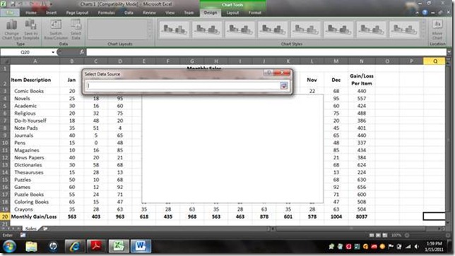
9. Select the range of cells that holds the values you wish to track with the chart. In this case we are going to show the total gains per month; so we will select B20-M20. Notice that as you select the range; the references are automatically generated in the dialogue box. Click the button at the right of the field again to bring the dialogue box back into full focus.

10. Notice that the months are not indicated in the Horizontal Category Axis. The value data will not do us much good without knowing what months they represent. So we will need to go in and pick up the months from the table using this dialogue box.

11. Under Horizontal (Category) Axis Labels, click Edit.

12. The Axis Labels sub dialogue box will pop up; click the button at the right of the field that allows you to select the applicable range of cells. Select the range of cells containing the months and press the button again.

13. Notice the range reference is automatically placed into the sub dialogue Axis Labels; click OK

14. Notice that the months are now listed in the Data Source dialogue box. We have not yet named our series. Click on Series1 under the legend Entries (Series) section. Click Edit.
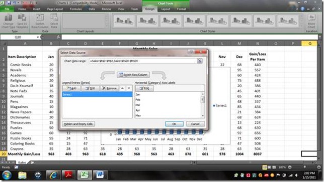
15. Click the button at the end of the field Series Name to select the cell that holds the name of the field that holds the values you are presenting.
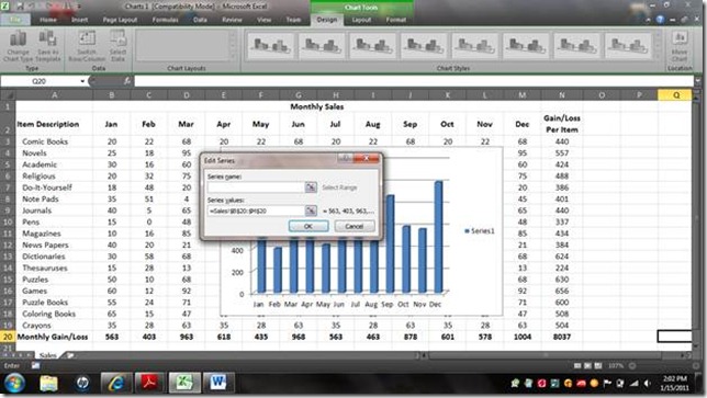
16. We are presenting the Monthly Gain/Loss values, so the cell holding the words “Monthly Gain/Loss” will be the cell we select in this case. Notice again that its reference is automatically generated in the dialogue box.
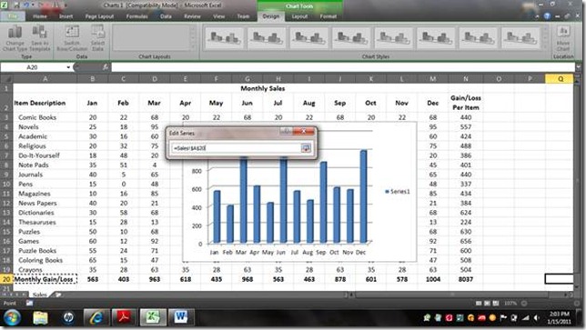
17. Once you have selected the appropriate cell; in this case A20, click the button at the end of the field again. Click OK

18. You should now be back at your Select Data Source dialogue box. Click OK and view your chart.

19. Notice that your chart was automatically placed right on top of your table. You’ll want to move it. You could click on the border of the chart and drag it to another location on this sheet or frame it as a new sheet.
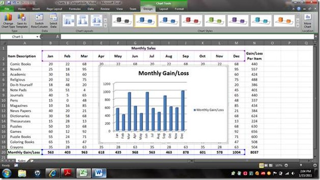
20. To frame it as a new sheet right click on the chart and choose the option to Move Chart…

21. Change the selection from Object In to New Sheet.

22. Once you have chosen ‘New Sheet,’ the Chart1 will be highlighted. Here you can type what you want the name of the sheet to be. In our case we are going to name this one Monthly Sales.
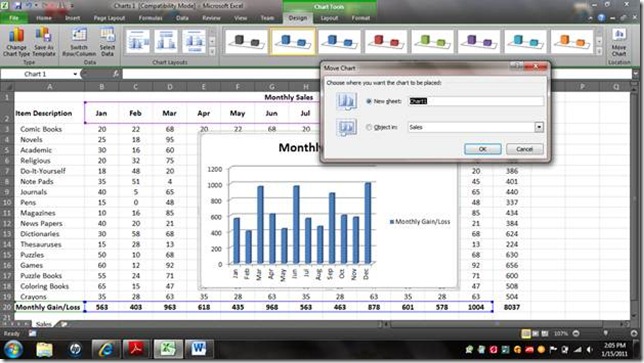
23. Once you have typed in Monthly Sales, click OK.

24. Notice that the chart is now on a sheet all of its own. Let say however, that you wanted to show the total monthly sales but you also wanted a sneak peak at what items contributed to those sales. Follow these steps. With the chart showing, click on the Select Data option on the design screen as indicted below.

25. In this instance we are going to select the entire range of the table that will be displayed on our chart. Click the button at the end of the field ‘Chart data range’ so that you can view and select the range appropriate for what you want to view on your chart.

26. Select A2-M19; (this will include the categories (months row 2) and the values (in rows 3-19) and the series in column A of rows 3-19) Once you have selected A2-M19 click the button at the end of the field again to bring the Select Data Source dialogue box back into full focus

27. Notice now that you have a series for every item listed on the inventory/table and all your months are included. Click OK.

28. Your chart then reflects a color coded column for each item of each month, but in some cases, such as this one, it causes the chart to become cluttered. This is an easy fix.
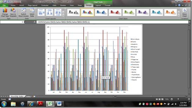
29. Select the Change Chart Type option on your Design ribbon

30. Choose a stacked chart of your preference. In this case we are going to choose the 3-D Stacked Cylinder chart style. Stacked means that the columns will be stacked on top of each other; not beside each other. This has two benefits: 1) you still are able to see the items contribution toward the sales and at the same time 2) get a the big picture view of total sales.

31. Notice that once you have selected the stacked column chart of your preference it will appear as below giving total sales of each month as well as the contributing factors for each month.

I hope you have enjoyed this tutorial
I’d like to also let you know that new features are coming to TechMustHaves.com; a page dedicated to the collection of free downloads that will empower your productivity whether it is in gaming, networking, office productivity, communications, financial management, tax preparations, etc. It is a new page and new items are being added every day. Currently it is secured and only viewable by guest id and password. Once it fully launches announcements will be made to this blog, so keep your eyes open.

No comments:
Post a Comment